“After doing this ‘Data Carpentry’ course module, I went back to use Google Maps for getting some directions, and I realized how much more beautiful a map can be; being taught TileMill gave me a whole new easy to use set of tools for building beautiful maps from open data.” (Participant at #DataHack)
The catalyst for this event was simple: Melbourne has changed a lot this past year and I’d like to know how to best get around it on my bike. This idea managed to get twenty Melburnians into the the boardroom at MediaHouse[1] – and they stayed?! Through three intensive ‘Map’ courses (including homework), these Open Knowledge activists not only learned how to build maps from Open Data but then produced some stunning pieces of art – yes, that’s right ART! The finale of this course was a ‘Data.Hack.Map’ Art Gallery, read on to find out how you can get involved so you too can build beautiful maps.
Warning beautiful maps follow (at the bottom of this post) 😉
For the first class (first Wed evening of the month) twenty+ people showed up, including journalists, cartographers, developers, civil servants, students, geospatial experts and many more – a collection of people which assured that everyone was going to learn something new! The topics we covered, included:
- What is TileMill; How does it work and how will I be using it to make my own data map; What is this HTML-like language called CartoCSS (which allows me to changes the look and feel of maps), and
- Where can you get open map data? Introduction to OpenStreetMap and pulling in data based on OSM tags: difference between points, lines and polygons (and how to make them have a look & feel on the map)
- Homework[3]: dig around the TileMill server we have provided for you and create your own map! Hint: do simple things: change colors, thickness of lines, arrange points on the map; if your feeling brave try importing some data from OSM). Most importantly everyone was told to borrow from one another maps on the TileMill server we set up: this event is OPEN so sharing is GOOD!
The second class (2nd Wed evening of the month) we had everyone present the maps they created as part of their homework to everyone else (some old school ‘show-n-tell’). Based on everyone presenting what they learned about mapping (as well as encouraging everyone to declare what aspirations they had for building a map) we encouraged people into like-minded teams. The exciting development from this class was the creation of teams that wanted to make other kinds of maps (instead of cycling – which is exactly what we were hoping would happen). We learned some really important things from this class as well, things we would do different next time to make sure everyone was catered for:
- What are some of the tricky syntax options in TileMill; how do you declare classes…; what if you want to have more than a single CartoCSS file for doing multiple layers and levels of Catographic design on a map
- Who had a lot of trouble? We want you to be proud of taking on new learning and do an extra session with the class Sensei this weekend. Learning something new that is a struggle should be praised! Don’t give up, fight to know it. You can do it!
- Homework: In your newly formed teams decide what map you are going to make, declare a ‘map platoon leader’ and have them assign roles to the rest of the team for creating the map (e.g. who is collecting the data that is needed, who is formatting/wrangling the data so that it can be loaded into the map, who is doing the cartographic styling; who is preparing and delivering the final map for printing so it can be displayed at the finale art gallery; who is writing the speech that will be given at the art gallery on behalf of the team while people quaff wine and cheese, who is coordinating outfits for the team at the Art Gallery. etc).
The third class (3rd Thurs of the month) we declared a ‘Study Hall’ where the teams could do more work with one another as teams. This also allowed the organisers to go around and make sure everyone was up to speed on what to expect for the finale class (and “Art Gallery’). Again, there are a couple of key lessons we’d utilise next time:
- For those still having trouble with TileMill, get them together and work through their problems. Encourage ‘ciritical feedback’ as a course can always be better and engage people’s learning styles in better ways.
- Get people excited about the finale Art Gallery and presentation of their printed map (if they want to have a digital flat screen version alongside their printed version fine, but don’t underestimate the quality of a high-quality printed map for beauty – let alone likelihood that someone is going to want to hang it over their fireplace!).
- Have teams give you emails of friends and family that they can invite to the Art Gallery – nothing like an email from the organisers to brag about the students and what they are doing: we all like our families to be proud of us and what we are learning and creating!
For the finale class / art gallery (4th Wed of the month), we hosted an Art Show[2], where there was no agenda, but rather an emphasis that people should socialise, quaff wine, eat cheese (in our case BBQ) and do their utmost to think about what makes a map beautiful. It was great fun: everyone walking around asking the ‘teams of artists’ how they achieved their beautiful maps. Some things that worked quite well (as well as ways to improve it) included:
- Food and wine stations positioned near to each of the different maps (keeps people circulating and congregating around the maps).
- Encouraging the designated team ‘cryer’ to give a two minute speech on the art they had produced.
- The right mood lighting is essential, maybe some fake digital candles and spot lighting for the artful maps.
We’d welcome more feedback from participants, especially here on this blog in the open so that anyone else wanting to reuse this course syllabus can also learn from your experience (we’d recommend leving comments in the form of: a.) one complimentary comment for what we should continue doing, and b.) one critical comment for what we could change to make it even better!
Above all, we’d like to thank everyone (organisers and participants alike[4]) for volunteering their time to do good for the Open Knowledge movement!
And now for the moment you’ve been waiting for…
The unveiling of the maps 🙂
DISCLAIMER: the maps shown below are done at different ‘height’ ratios to show their details, e.g. the digital version doesn’t really show how beautiful these maps are when printed (unless perhaps you have a monitor that is A1 in size).
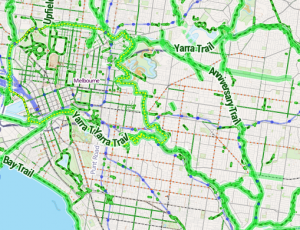
The course Sensei @Stevage1 did an amazing job of both teaching as well working on this own map. This (for me) is *The-New-Bicycle-Map-for-Melbourne* (something I plan on lamenting and carrying on my bike from now on).
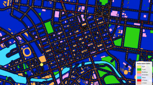
The below map by Darren Yu speaks for itself, as there is something very quirky about the grid layout of Melbourne CBD. I love the idea of the PacMan video game and making your way around the city via tram, bike, foot and collecting points as you move from intersection to intersection (I guess the only question is how to avoid the ghosts!).
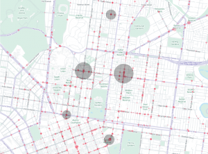
This map, is going to make waves as it is not only a map of cycling routes, but of dangerous cycling routes & spots! Stay tuned for this map going viral as I think we are going to see news stories about it soon.
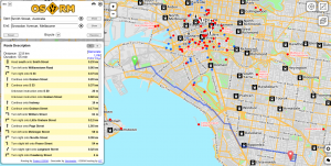
And then there is a map that does it all, this map not only provided cycle routes but it also was able to predict what was the best cycle route to take through the city (stay tuned for the mobile map app!).
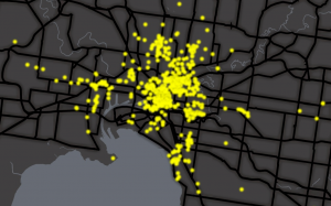
For me, the most exciting map was the team which created a map of where you can find Melbourne street art:
I like this map so much I’ve had it framed so I can hang it in my house as they main ‘fire-mantle’ piece as part of my personal collection. I love the meta question that this map invokes: Q: “Ah what is that map of that looks like someone has spray-painted on it?”. A: “Well, it is a map of where Melbourne Street art is, the size of the ‘spray paint’ explains how much art there is there”. For me this map is beyond beauty, it is a statement about the love of Melbourne and how street art is a part of its DNA, what makes it unique and special out of any other city I have lived in…
On that note, I’ll leave off with a little reflection: this event was beautiful (it was horribly organised by yours truly), but the talented Melburnians who came to it and made it their own and produced things of beauty are why labouring for Open Knowledge is worth it. This event was free, open and enabled everyone to learn more – it proved that Open Knowledge can do magical things when you commit to it. Best of all, I love this city more than ever before and want to make it even better. That’s what Open Knowledge is about.
FOOTNOTES:
[1]= Many thanks to The Age’s DataPoint news team for hosting the event in their beautiful HQ at MediaHouse, next to SouthernCross train station.
[2]= Thanks to The Australian National Data Service (ANDS) for supporting this event, Directors Ross Wilkinson and Cythia Love were able to take time out to come and talk with the participants about this new data-mapping tool.
[3]= “Here’s a written version of my speedy presentation of the homework on Wednesday night. Sort of a walk-through, if you will: 1. Connect to the tilemill server, as per David’s instructions. 2. Create a new project. 3. Add a layer with all the ways (aka ‘lines’) from OpenStreetMap for Melbourne: a.) click the layers button on the bottom left, then add, b.) Click PostGIS (remember?), c.) Click data source, select the favourite (ubuntu/ubuntu…), d.) Give it an id. You’ll use this to style it with; e.) Leave the other properties default; 4. Click “Save and style”. This creates a basic style for it. 5. Now, feel free to go digging in the other projects to copy some more styles, layers etc across. In the process, you should learn a lot about how TileMill works. These links will be helpful: a.) http://mapbox.com/tilemill/docs/crashcourse/introduction/ b.) http://mapbox.com/tilemill/docs/manual/carto/ c.) http://mapbox.com/tilemill/docs/manual/adding-layers/
[4]= Additional Notes:
- Participants twitter handles include: @annielouey @awise22 @Brynushka @cartdeco1 @DFFlanders @marcmoncrief @mechamoth @om_henners @simokeefe @SirRustyroo @stevage1 @woowoowoo @ZedJS

Wow, great maps! What a terrific course.
I know this is an unusual request to make of exhibited art, but are any interactive versions, or internals (source code, data) going to be available? I’d love to take a peek at how some of these are done, and also some of the data sources.
PS I think there’s a minor typo in the post, unless you really are “lamenting” one of the pieces. 🙂
Hi Angus, I helped run the sessions. The Carto styles for my bike map (the lamented one) are here: https://github.com/stevage/stevebikemap
Good idea to get the others out there as well.
I’m also planning a blog post on all the behind-the-scenes sysadmin stuff to create your own tilemill server with OSM data etc.